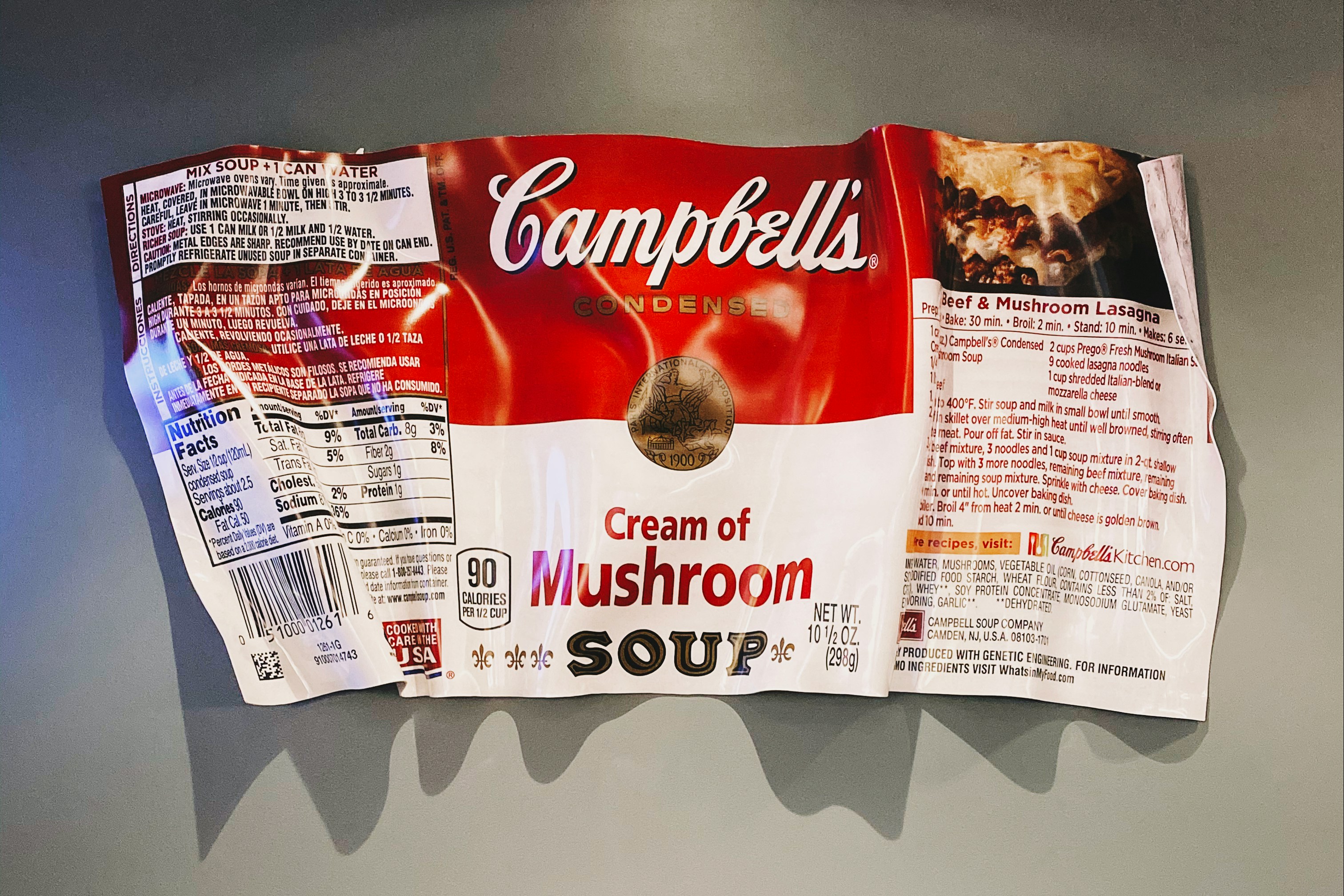
In the food and beverage industry, vibrant colors are like delicious ingredients – they entice, engage, and leave a lasting impression. But just like adding too many spices can overwhelm a dish, using too many colors in your logo can create visual chaos and confuse your audience. Here's why sticking to a maximum of 3 colors is like the secret recipe for logo success:
1. Enhancing Appetite Appeal: Food & beverage logos are visual appetizers, drawing customers in before they even taste your product. A simple color palette ensures the focus remains on what matters most – your delicious offerings. Imagine a logo with 10 colors competing for attention against your stunning bakery photo – the impact weakens. Think Starbucks' siren green or McDonald's golden arches – these single-color icons instantly trigger cravings without visual overload.
2. Memorable Munchies: Our brains love simplicity. Logos with fewer colors are easier to process and store in memory. Think back to your favorite childhood candy logo – chances are, it uses a limited, impactful color palette. This instant recognition is crucial for brand recall, ensuring customers easily identify your products amidst a crowded supermarket shelf.
3. Versatility is the Spice of Life: Your logo needs to adapt to various packaging sizes, social media avatars, and marketing materials. Too many colors complicate this journey, potentially losing impact due to printing limitations or poor translation across digital platforms. Sticking to 3 allows for consistent brand expression, regardless of where your logo appears.
4. Communicating Flavors with Color: Colors have powerful psychological associations. A well-chosen palette can subtly communicate your brand's personality and flavors. For example, red evokes passion and excitement, perfect for spicy sauces, while green signifies freshness and health, ideal for organic brands. With fewer colors, your message becomes focused and impactful, letting the colors truly "speak" about your brand.
5. Timeless Appeal: Escaping Trend Traps: Trendy color palettes might seem tempting, but they're often short-lived. Opting for classic color combinations ensures your logo stands the test of time, avoiding the risk of appearing outdated as trends fade. Think about Coca-Cola's red and white or Pepsi's blue and red – these iconic logos haven't changed their core color schemes in decades, proving the power of simplicity.
In conclusion, remember that your logo is the visual face of your brand, and just like a well-crafted dish, it needs to be balanced and impactful. Limiting your color palette to 3 or less ensures clarity, memorability, and consistency, ultimately leaving a lasting impression that keeps customers coming back for more. So, resist the urge to overcomplicate, embrace the power of simplicity, and watch your food & beverage brand logo become a mouthwatering symbol of success!


.jpg)


